30 Plotting options
Ryabhatta
The expression of the selected genes (see Enter gene names to visualize ) can be visualized in Ryabhatta using the following plotting options:
30.1 Violin plot
A violin plot is used to explore quantitative expression of genes in the single-cell clusters. The width of the violin shows the density of the cells at that expression level. In Ryabhatta, the violin plot show the median, and the 5th and 95th percentile marks in the expression
If a meta data type is selected using the Selecting meta data category the violin plot is colored according to the meta data category. Each cluster is split per the meta data category and an individual violin plot is created for each of the sub categories.
Individual genes are plotted as separate, vertically-aligned violin plots
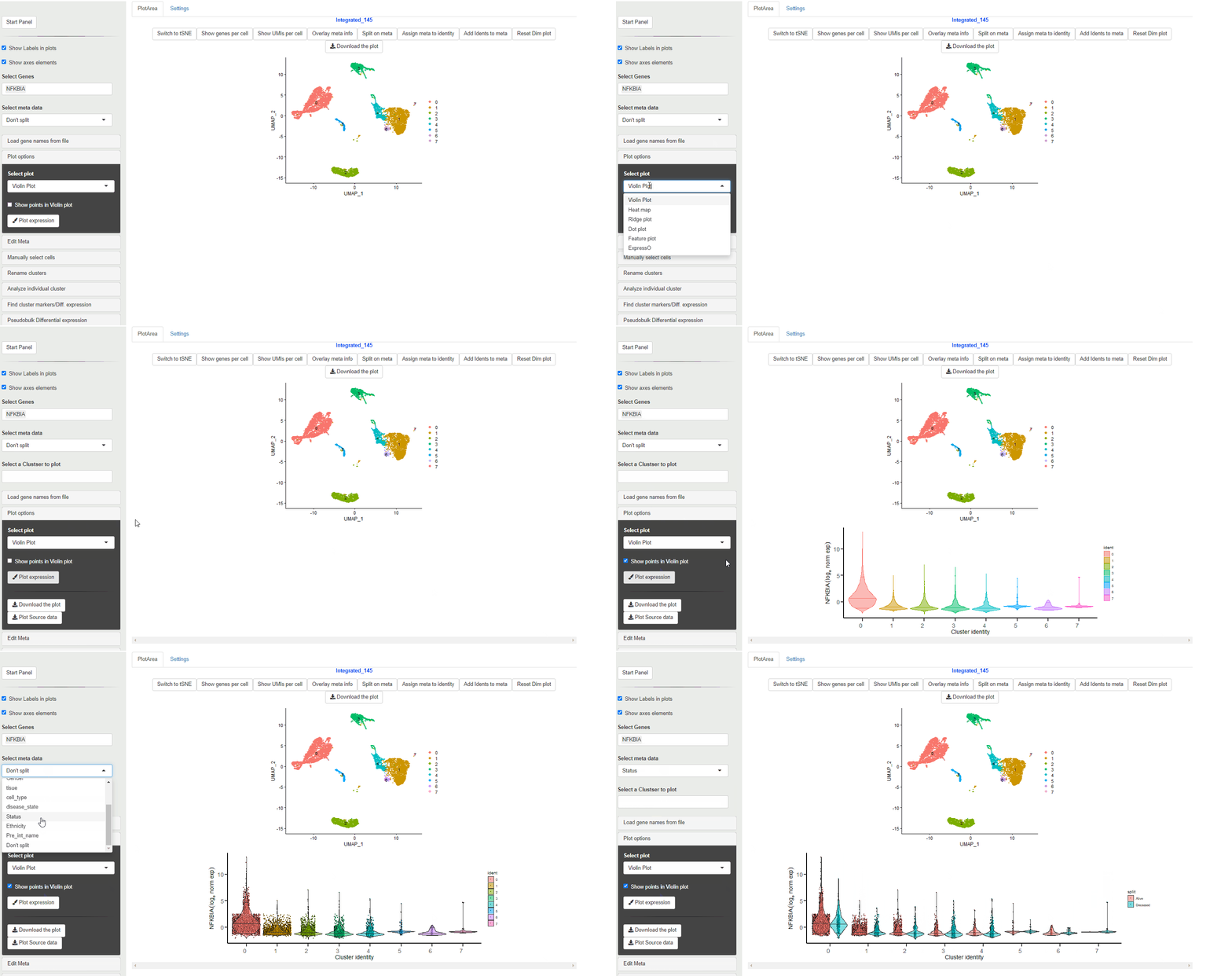
Violin Plot
Violin plot generated through Ryabhatta show expression directly from the normalized expression slot. This data (as of version 4.0 of Seurat) is log normalized expression.
The plots also show median (center, horizontal line), 5th and 95th quantiles values.
A vertical line with no density change (no violin) does not mean NO cells from that cluster/condition express the gene. Selecting Show points on the Violin plot option can help with displaying the cells that show expression albeit present sparsely within the cluster.
30.2 Heatmaps
Heatmaps can be used to visualize scaled expression of genes in Ryabhatta. The scaled-expression is obtained from the scale.data slot of the assay.
Users have the option to cluster genes according to their expression. To use this feature, at least 5 genes must be selected. If at least 5 genes are present, and the option to cluster genes is selected, hierarchical clustering is performed on the scaled data of the selected genes. The genes are reordred according to their relationship in this clustering.
Note: this clustering is not saved. So repeating this process might yield slightly different results owing to the fact that leaves on a branch are switchable in a non-directional hierarchy
If the order of the genes entered needs to be preserved, users can uncheck this option.
Since scale.data slot increases the size of the Seurat object, scaling data is not performed on all the genes. If the selected gene is not present in the scale.data slot, scaling needs to be performed prior to heatmap generation. In Ryabhatta, if a gene is not found in the scale.data slot, then scaling for all the selected genes is performed prior to heatmap generation.
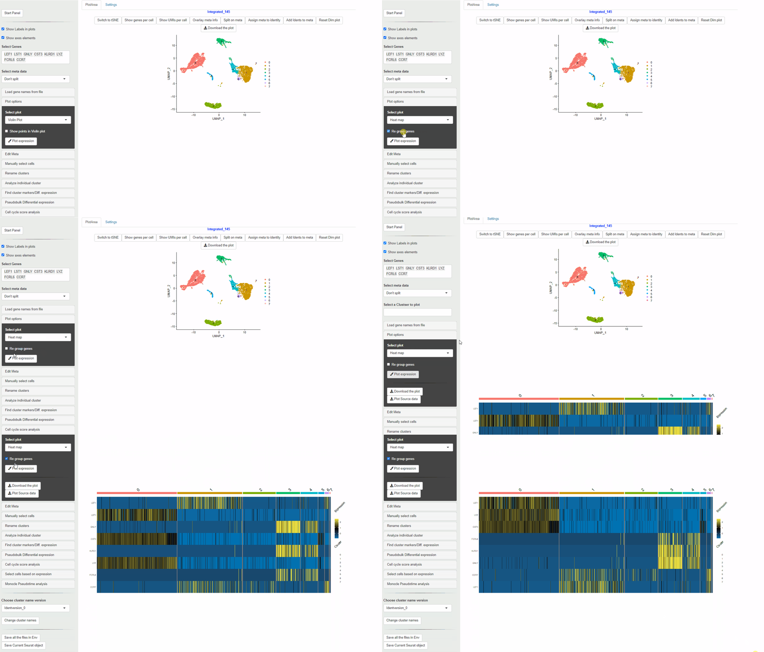
Heatmap
30.3 Dot plots
Dot plots are used to evaluate of percentage of cells within a cluster that express a gene, along with the expression level in color scale.
The size of the dots show the percent of cells within each cluster or meta data category that show expression of the gene. The color scale shows level of expression.
For Ryabhatta, we have modified the plot to show an independent scale for each gene. This is in contrast to the native DotPlot function in Seurat where all the genes are displayed on the same color scale. This can affect ability to discern the expression differences of genes that are relatively less abundant.
Also, the scale for the size of the dots is fixed from 0% to 100%. This means that dots are comparable between plots and does not inflate small percentage change in the number of cells expressing a gene.
When a meta data category is chosen for the plot to be split, then the data is shown as Z-transformed expression.
It is possible to choose the native DotPlot appearance using the Use Native Dot plot option.
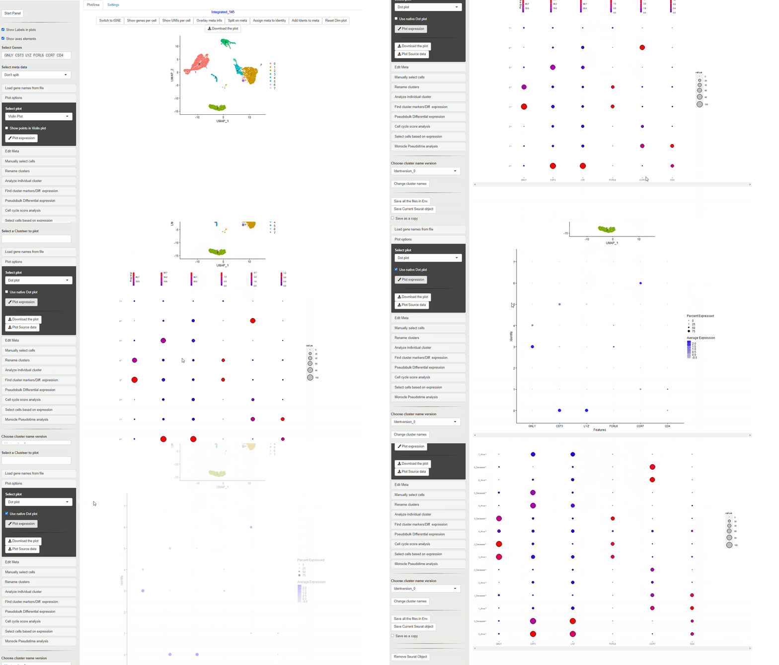
DotPlots
30.4 Ridge plots
Ridge plots are similar to Violin plots in displaying expression and density cells at different expression levels. However, they provide the advantage of being compact and are useful to display changes in expression level over time.
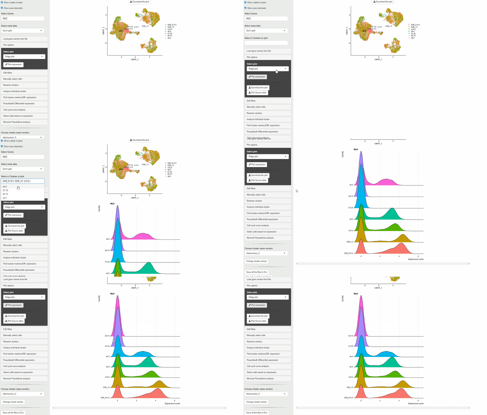
RidgePlot
30.5 Feature plots
Feature plots show expression of the selected genes overlayed on top of the UMAP/tSNE plot. This allows exploration of gene expression in different cluster using the relative positions of the cluster in UMAP/tSNE.
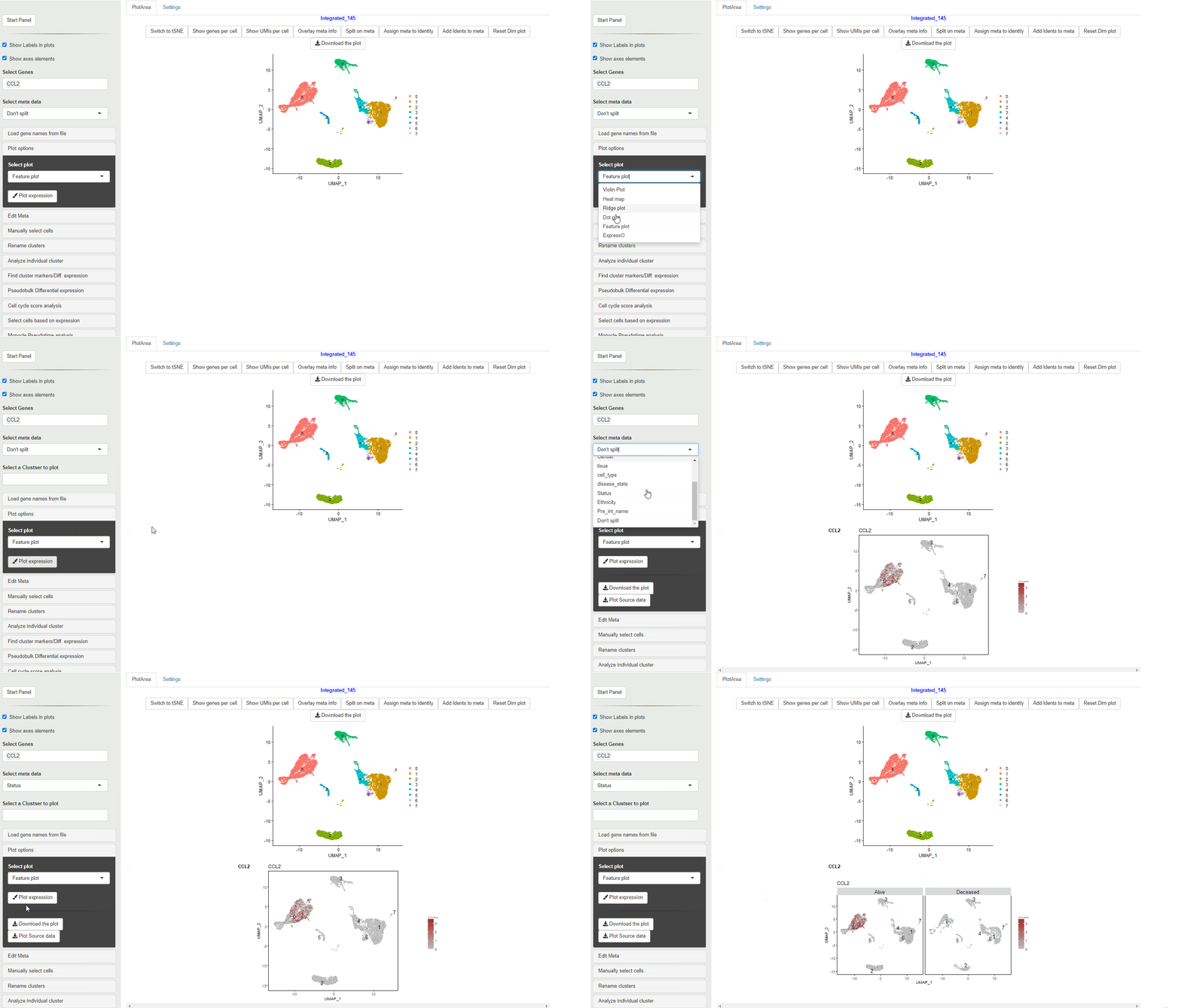
FeaturePlot
30.6 ExpressO plots
ExpressO or expression overlay plots can be used to view the expression overlap between three genes. In this case a feature plot for the expressio of the individual genes is shown with a merge plot showing the overlap of these genes through a color combinations.
The gene first in the list is colored red, the second gene is shown with green and the third gene is shown in blue.

ExpressO Plot
30.7 Download expression plot
A high resolution PDF version of the plots produced (as described above) can be downloaded using the Download the plot button.
NOTE: This button is for the expression plot. The other Download the plot above the DimPlot is for downloading the Dimensionality reduction plot with cluster, meta data or qc metrics.
30.8 Download source data
Many journals require “Source data” for plots used in figures. To meet this requirement, the source data for each of the plots (expression values vs points/clusters) can be downloaded using the Plot Source data button. This data can be also used to perform statitcal tests and analysis on the plot data.